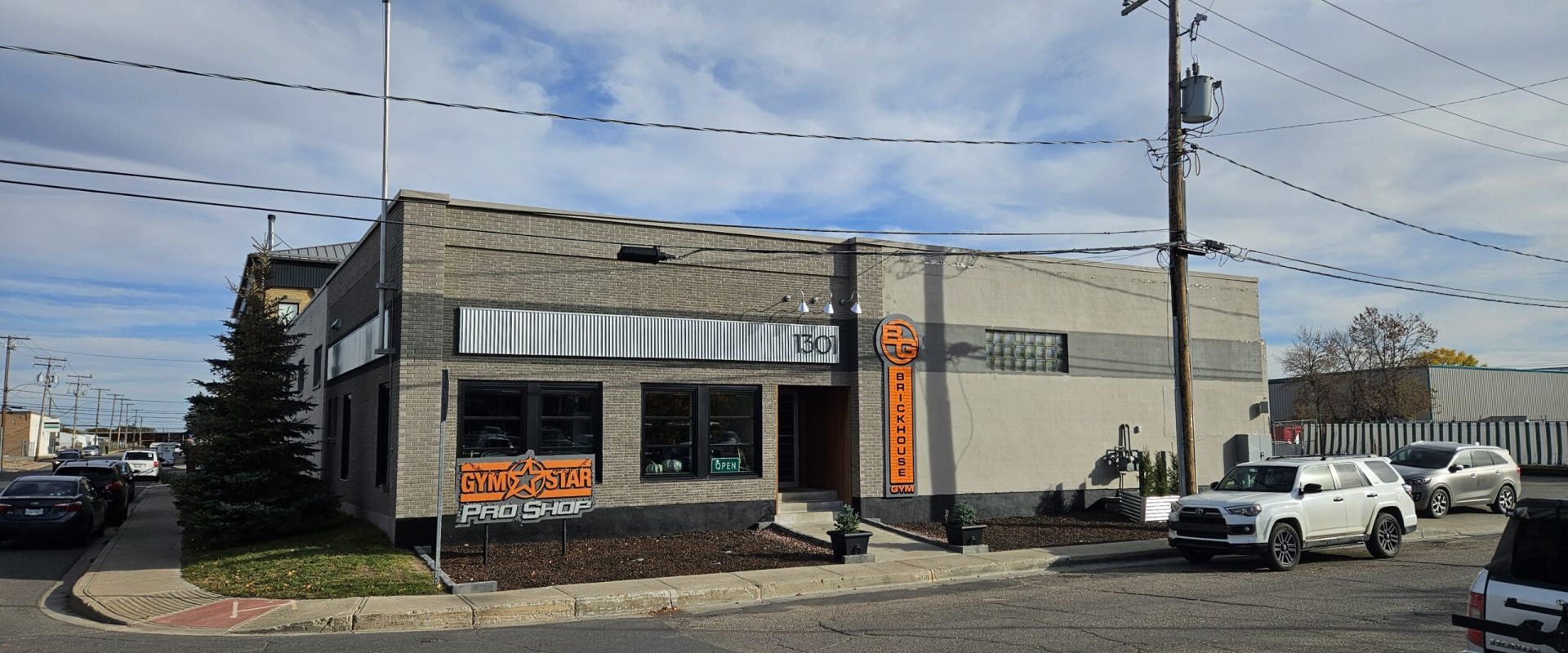
Our new Brickhouse Gym sign is finally installed, and it looks phenomenal. This wasn’t just another upgrade on the checklist. This sign carries a story, a history, and a level of meaning that most people would never see at first glance. It represents pride, legacy, and the evolution of everything Brickhouse stands for.
People sometimes ask why we waited two years to put a sign on the new building. In most cases, a business puts signage up before they even open the doors. But for us, this wasn’t about rushing a logo onto a wall. The delay had purpose. For those who know our roots, and even for those who don’t, the sign on our Gym Star Pro Shop has a deep emotional tie.
Back in 2015, when we opened the east-side Gym Star Pro Shop on Victoria Avenue, Chantal’s dad, Roland Claremont, built our original sign by hand. No cookie cutter templates. No store bought parts. Just pure craftsmanship. That sign wasn’t just a marker for a storefront. It was a symbol of someone believing in us. It was a piece of family legacy welded directly into the heart of our business.
That sign has followed us through multiple chapters of growth and struggle. It’s seen long nights, early mornings, big ideas, and hard lessons. It’s more than wood and metal. It represents the beginning of something that would eventually become Brickhouse Gym.
So when it came time to design the new Brickhouse sign for 1301 Osler Street, the decision wasn’t as easy as picking a modern template. I wanted something unique. Something that captured the spirit of Roland’s craftsmanship. Something that tied our story together, past and present, in one bold statement. In the end, we made the choice to pay homage to his original work by replicating the style as closely as possible, creating a sense of unity between the Pro Shop sign and the Brickhouse Gym sign.
Both signs now share the same heartbeat. The same look. The same energy. One represents our roots. The other represents our evolution.
When drafting the design, we knew the new sign had to be big. It had to be bold. It had to reflect everything Brickhouse Gym has come to stand for—strength, high standards, and a relentless commitment to creating a serious training environment. Our brand isn’t timid, and our sign couldn’t be either. It needed to set the tone the moment someone pulled into the lot.
The final result hits that mark perfectly. Sharp edges. Clean lines. A powerful vertical presence. It’s a visual declaration of who we are.
The sign itself was handcrafted by Sharp Signs & Graphics, a locally owned Regina shop. Supporting local has always mattered to us, especially for a project that carries this much meaning. They took our concept, honoured the original style, and executed it with precision. The craftsmanship shows the moment you see it up close. They didn’t just build a sign. They built a tribute.
Now, when you turn onto Osler Street, the message is clear before you even step inside the gym. You’re entering a place built differently. Built intentionally. Built with pride, passion, and a respect for the work it takes to create something meaningful.
This sign marks a new chapter for Brickhouse Gym. It matches the energy inside the building, the upgraded equipment, the expanded layout, the cleaner-than-ever environment, and the culture our community has helped build brick by brick. It announces our identity to the city, not through sales pitches or gimmicks, but through presence.
Brickhouse Gym has always been about raising the standard. This sign is the next step in that commitment. It stands as a reminder of where we started and a promise of where we’re going.
A legacy built by hand. A standard built through intention. A community built through discipline.
Strength. Standards. Community.
Built Brick by Brick.


